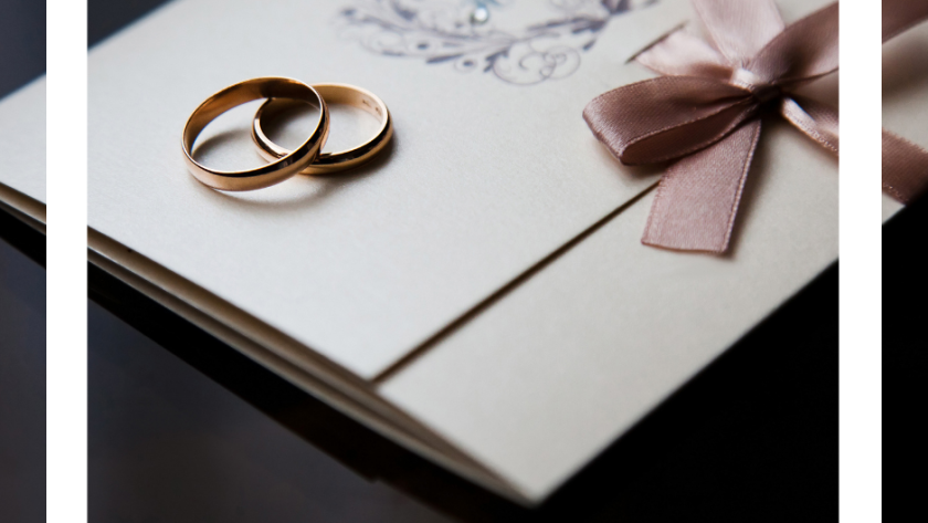
Okay, real talk: why are we still pretending that wedding invitations are just pieces of paper people toss after the big day? No, girl. It’s 2025. Your wedding invite deserves the same respect as a gallery print — because it’s literally the first glimpse anyone gets of your whole vibe. And honestly? If your guests don’t feel low-key guilty throwing it away, you did it wrong.
I’m not saying go overboard or drain your savings. I’m saying be intentional. Treat your invitation like a mood board — one that your grandma wants to frame and your bestie wants to pin on her inspo wall.
So, let’s break down how to make wedding invitations that are more wow and less “trash bin casualty.”
1. Choose Paper That Actually Feels Like Something
If the paper is flimsy, it’s giving takeout menu. Sorry, but it’s true. Go for thick, luxe cardstock — or even textured papers like cotton or linen blends. It doesn’t just look good; it feels like quality when someone holds it. Think about it: the weight of your invite sets the tone before they even read your names.
2. Think Color Story, Not Just Wedding Colors
Everyone defaults to blush, beige, or dusty blue — which, fine, but you’re not everyone. Pick a palette that actually tells your story. Earthy terracottas for desert chic, moody greens for woodland magic, or bold black-and-white if you’re modern glam. It’s not about matching napkins at the reception. It’s about creating a mini art print people want on their corkboard.
3. Typography Is the Real Secret Sauce
Fonts carry personality, babe. A sharp serif screams timeless elegance, while hand-drawn scripts whisper “romantic, but not trying too hard.” Pairing fonts is like styling an outfit: you need balance. One bold, one subtle. If you wouldn’t wear two statement necklaces at once, don’t use two dramatic fonts on your invite.
4. Add Something Unexpected
This is where you turn a basic invite into a keepsake. Maybe it’s a line-art illustration of your venue. Maybe it’s a tiny pressed flower sealed into the envelope. Or my favorite: a custom map sketch of the town. Guests love little surprises, and those small details are what make people hold on instead of tossing.
5. Don’t Sleep on Envelopes
Yes, the envelope is part of the experience. A soft pastel with a contrasting liner feels designer. Wax seals? Always a moment. Hand-drawn calligraphy or a printed motif across the flap? Chef’s kiss. The outside should already feel like an unboxing before anyone even sees the invite.
6. Minimal Doesn’t Mean Boring
Some of the chicest invites are stripped down to a clean design with just one bold element — like oversized initials or a single brushstroke of color. If you’re not into florals or frills, lean into that. Minimalism with confidence never looks cheap. It reads as elevated.
7. Make It Functional (but Pretty)
No one loves rifling through six separate inserts. Consolidate with style. Use a fold-out format where the RSVP, schedule, and details are built in. Or add a QR code tastefully printed in the corner for digital RSVPs (bonus: way less paper waste). Practicality is not anti-aesthetic if you do it right.
8. Treat It Like an Heirloom
Your invitation is part of your wedding story — future you will be so glad you kept one pristine copy. Frame it next to your wedding photos, tuck it in a keepsake box, or even scan it as part of your digital album. You’re not just designing paper. You’re creating a piece of your history.
Here’s the bottom line: wedding invitations are no longer just about “getting the info out.” They’re about creating a first impression so strong that people actually pause, admire, and maybe even post about it. This is the very first chapter of your wedding aesthetic. Why waste it?
So when you’re picking designs, remember — you’re not just planning a wedding. You’re curating art. You’re telling a story. You’re making something your guests might frame on their wall long after the party’s over.
Girl, you got this.
Click to preview Pinterest-friendly flyer
